Plan the session before it starts.
An automatic structure read of NQ with a plan for both sides, the odds from similar past sessions, an options strategy builder priced from the live chain, and scanners for premium sellers, volatility and relative strength.
Screenshots: GWT V2 1.0.3 on simulated market data.
Market Structure
A top-down read of NQ, done for you.
Market Structure reads NQ futures on the 4-hour, 1-hour, 30-minute and 15-minute charts automatically: swings, breaks of structure and changes of character, the dealing range and its equilibrium, the zones that caused each break, and a bias across all four timeframes.
- A plain-language story of the trend on every timeframe, and how many agree.
- A range ladder with the nearest levels across timeframes, plus prior-day high, low and close.
- Prepare the open: one plan with the structure and one against it, each with its path and invalidation.
How traders use itRead it before the open to know which side the structure favours, where it would be proven wrong, and which levels sit in between.
Read the Market Structure deep dive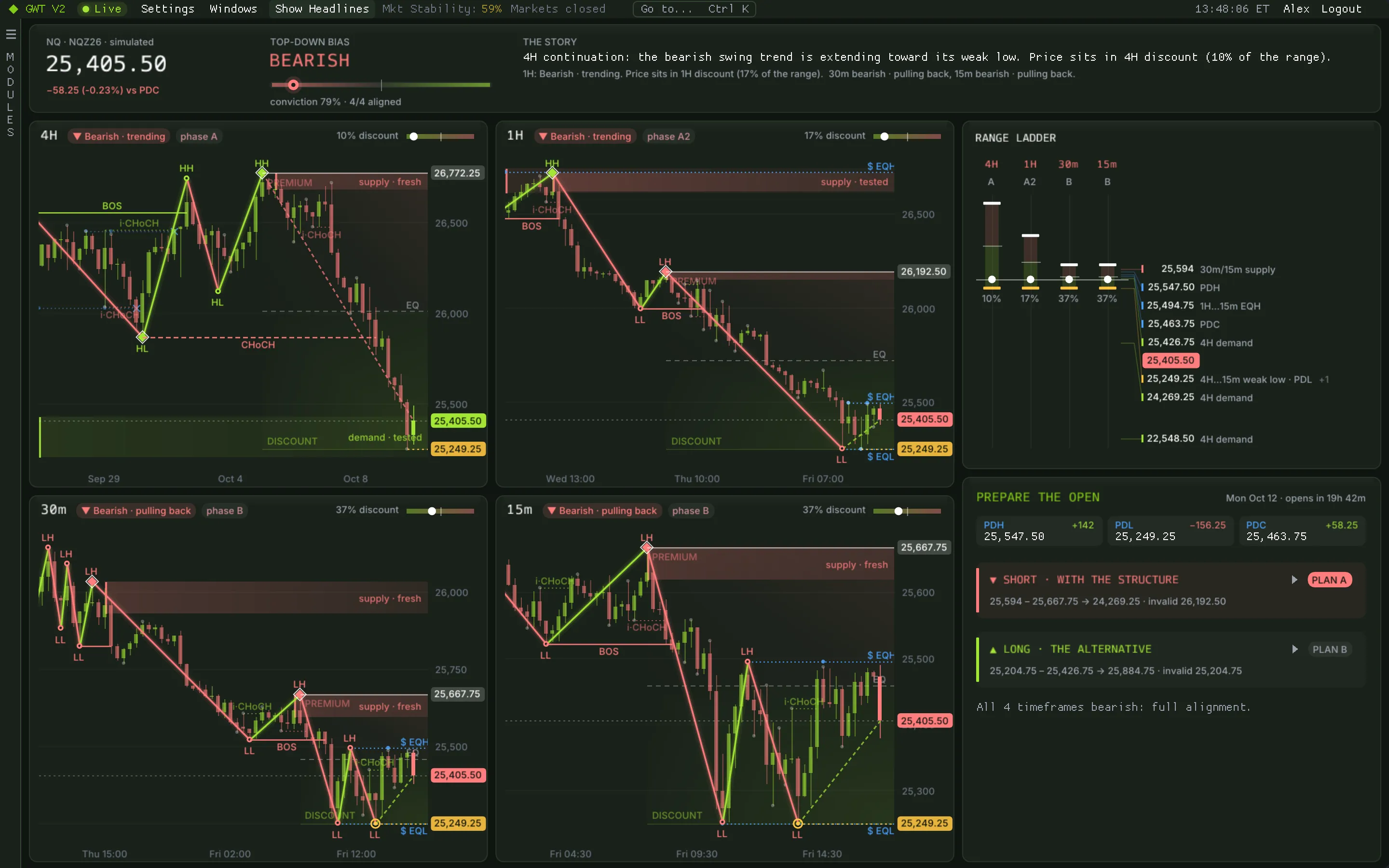
Scenario Lab
How did sessions like today play out?
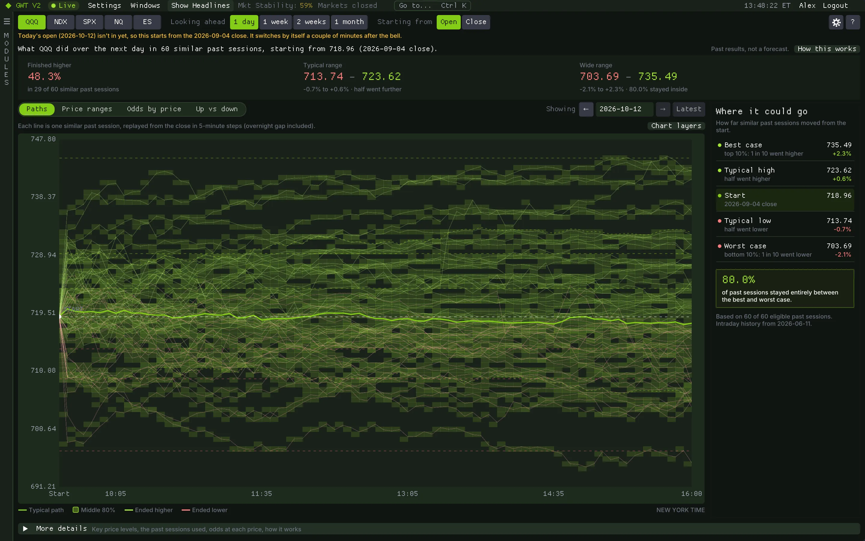
Pick an instrument, how far ahead to look and where to start. Scenario Lab finds past sessions that looked like today and replays what price did next from today's starting price. Three cards give the answer: how often those sessions finished higher, the typical range and the wide range.
- QQQ, NDX, SPX, NQ and ES, from one session ahead up to about a month, with up to ten years of history.
- Paths and density, a range map of six excursion levels, odds curves and bull and bear odds.
- Hover any price for its odds; go back to any past date to see what the lab would have shown then.
- Copy the levels to the clipboard for your charting platform.
How traders use itUse the typical and wide ranges to size targets and stops for the day, and read the sample note before trusting a frequency.
Options Profile
Build a strategy and see the whole payoff.
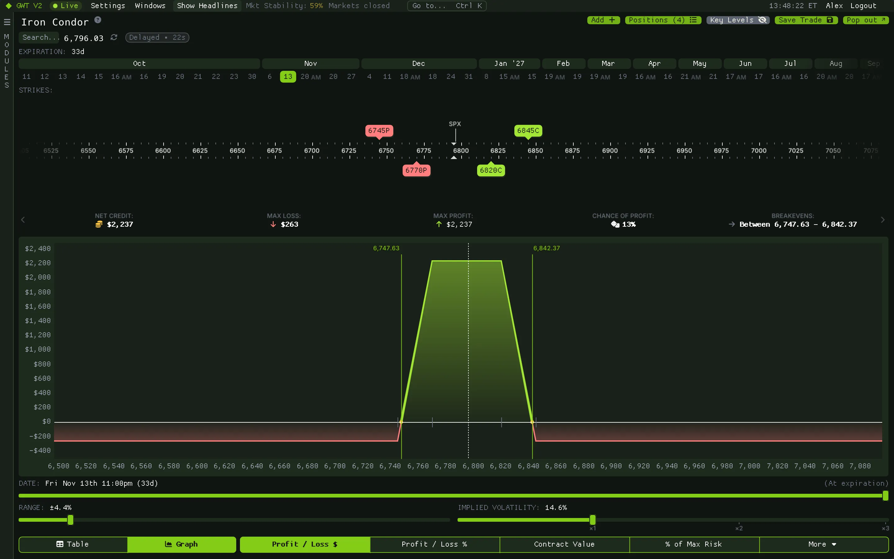
Choose from 62 strategy templates in four proficiency levels, or build your own from up to twelve legs. Every leg is priced from the live chain, and the profile shows the P/L curve, max profit and loss, breakevens, chance of profit and the net greeks.
- Drag strikes on the axis and move whole series to another expiry.
- Walk the curve from today to expiration and stress implied volatility from 0.1x to 3x.
- A table of prices by date, with P/L in dollars or percent, or any greek.
- Save a trade and share it as a code another member can paste into their own tile.
Wheel
Premium-selling candidates, ranked.
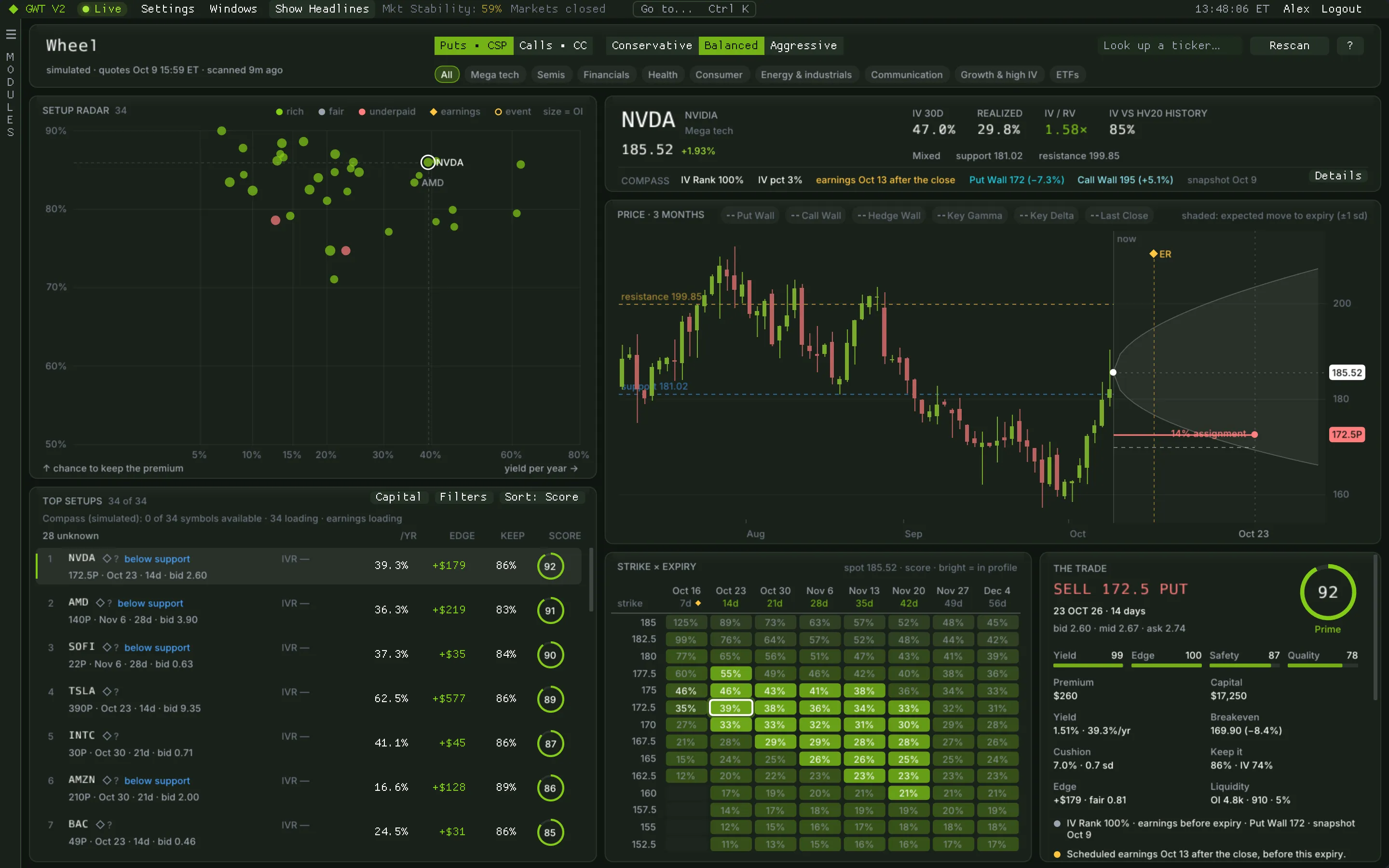
Wheel scores cash-secured puts and covered calls across 119 tickers from 0 to 100, weighing yield, edge against realized volatility, safety and quality. A setup radar shows each stock's best trade by yield and chance to keep the premium.
- Conservative, balanced and aggressive profiles choose the delta and days-to-expiry band.
- A capital filter limits trades to what one contract ties up.
- Every strike and expiry as a score map, an expected-move cone and the trade card.
- Honest numbers: premiums at the bid, never the mid; earnings and priced events flagged before expiry.
How traders use itShortlist names where the premium is rich against the stock's own volatility and no event sits before expiry, then check the levels on the chart.
Compass
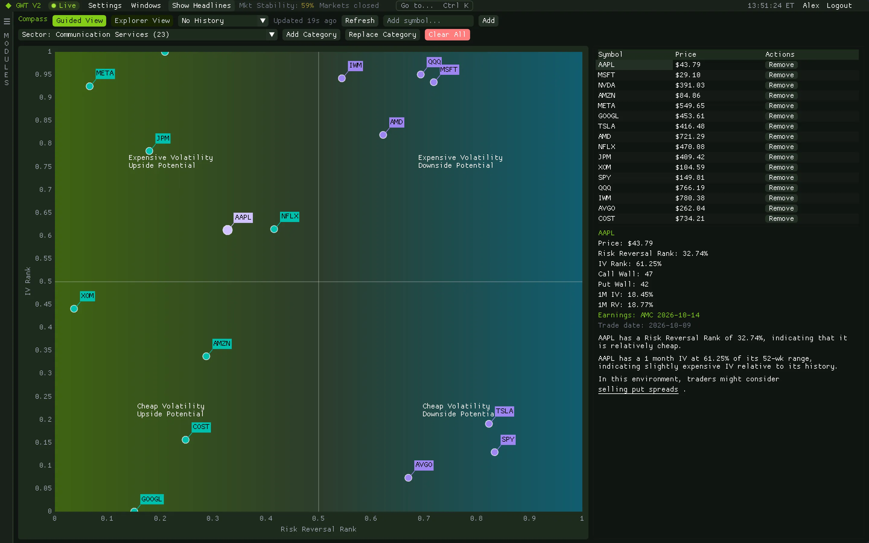
Sort the market by volatility and skew.
Compass plots tickers by implied-volatility rank against risk-reversal rank, which puts each one in one of four quadrants, with a plain-language read and strategy context for the one you pick. Swap the axes for other metrics and add earnings dates.
- Stocks and sector groups on one chart.
- A choice of volatility, skew and price metrics for each axis.
- Earnings marked, so event volatility is not mistaken for a trend.
RRG
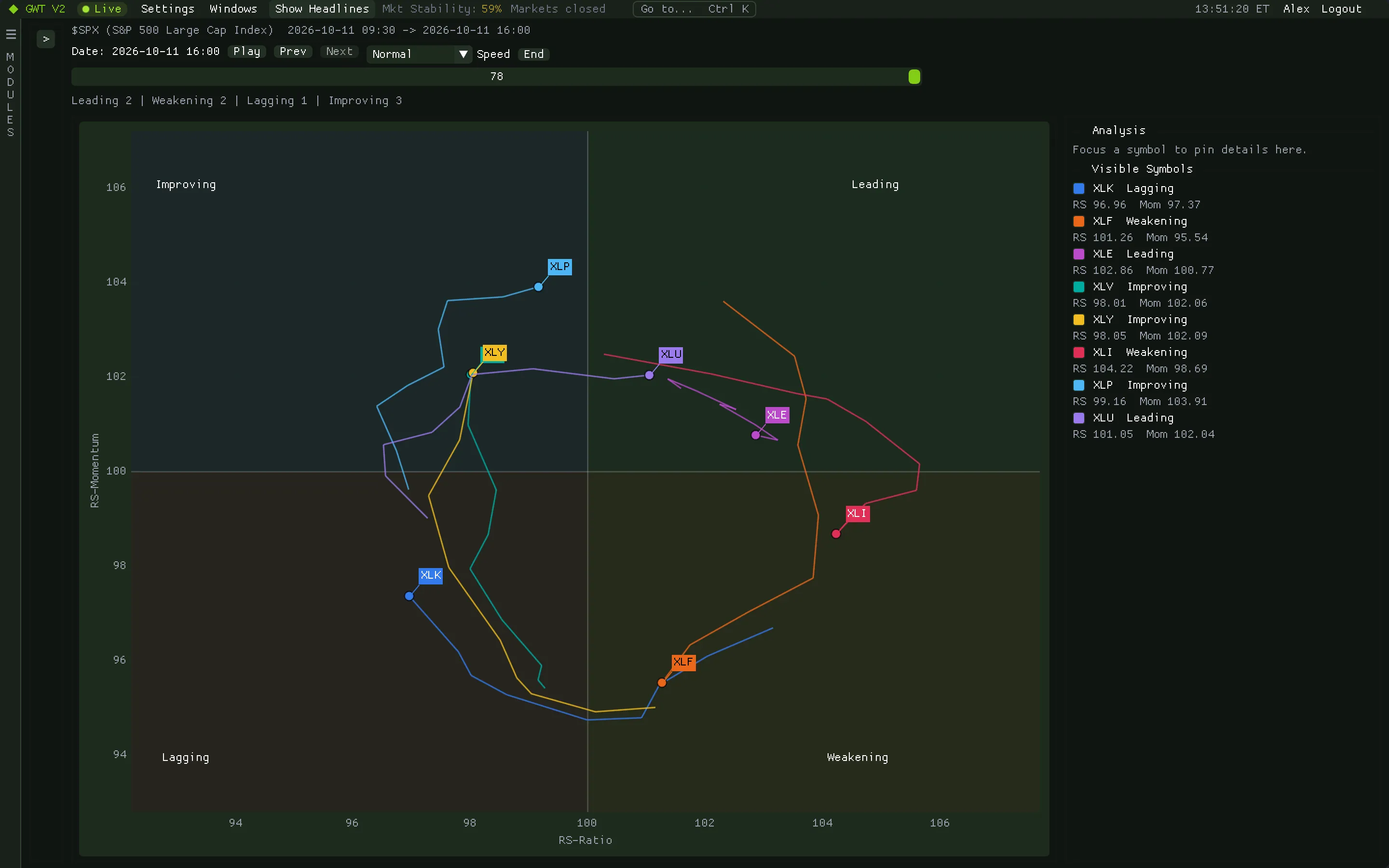
Which sectors are leading, and which are fading?
A relative rotation graph plots each ticker's relative strength against a benchmark and the momentum of that strength. Names rotate clockwise through leading, weakening, lagging and improving.
- Sector ETFs or your own list against the S&P 500 or another benchmark.
- Daily, weekly or monthly, with a tail showing each name's recent path.
How traders use itLook for names moving from improving into leading, and flag the ones sliding into weakening or lagging.
Supply Chain
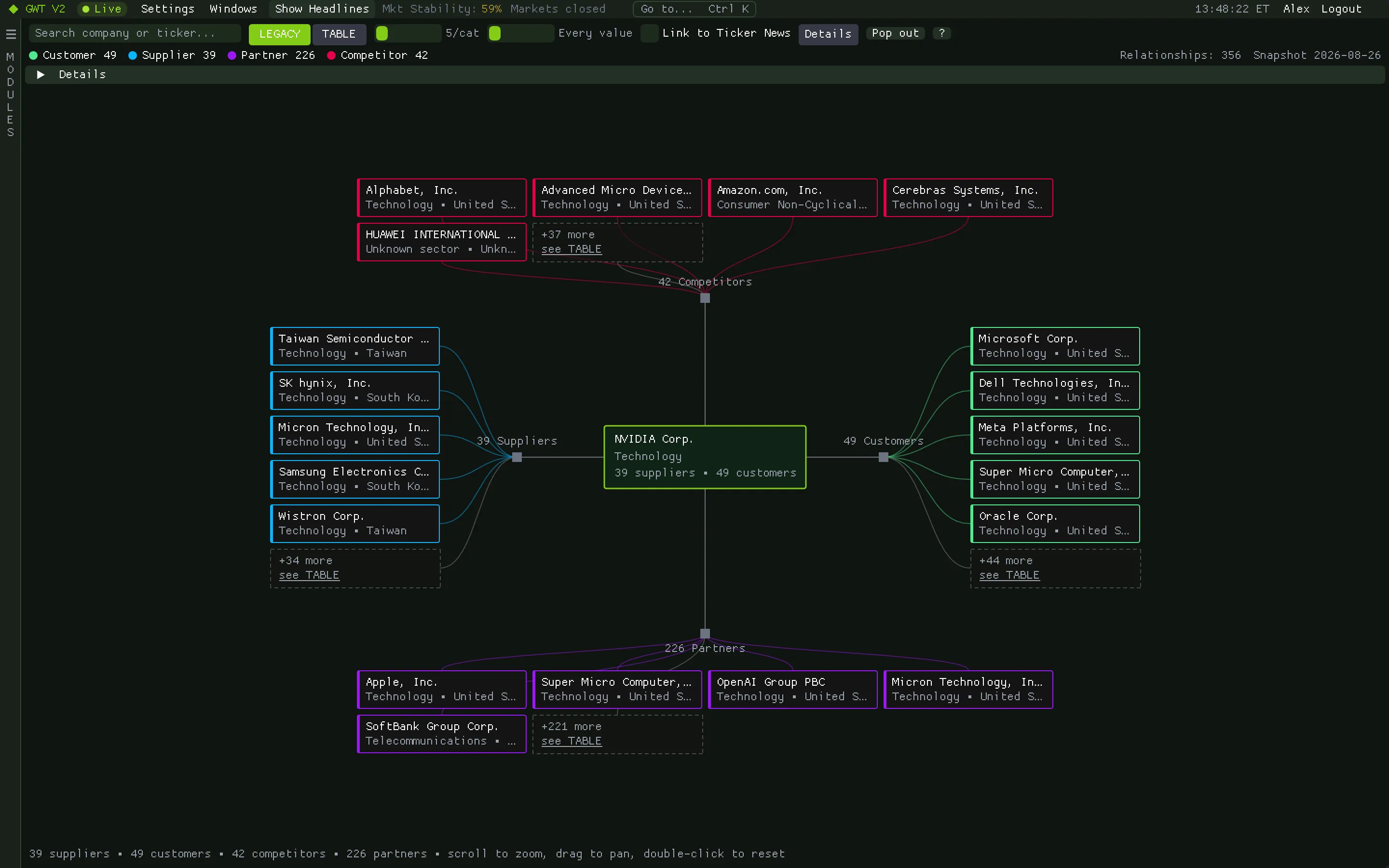
Who sells to whom.
Look up a company and see its customers, suppliers, partners and competitors as a graph you can walk, across about 19.8k companies. Click any node to make it the centre.
- Graph and table views with filters by relationship type.
- Search by ticker or name.
- Pop it out into its own window to keep beside your charts.
How traders use itWhen one company reports or makes the news, check which customers and suppliers are likely to move with it.
Keep exploring
Related modules
Ready when the open is
Put gamma, flow and liquidity on one screen.
Get your access token, download the app for your Mac or PC and paste the token at sign-in. It takes about two minutes.